How to apply colour psychology in the redesign of biometric applications
Collaborators:

Martina Budziňáková
Product designer, ABIS, Innovatrics

Alica Hollá
Product designer, ABIS, Innovatrics
Biometric applications should not only be technologically advanced, but also as easy to understand and navigate as possible. Delve into how Innovatrics applied colour psychology principles in the ABIS redesign, creating a consistent visual language and simplifying tasks for thousands of users.
Have you ever wondered why the colour red makes us think about love? Or why yellow evokes joy or black fosters sadness and grief? Colours play a significant role in how we experience the world. They affect our emotions and seeing them makes us feel and act a certain way. Many companies understand this and use colour psychology to influence the behaviour of their target audience.
Think of a website or mobile app you visited recently. Did the design prompt you to explore further, or did it make you want to run away? If the latter happened, think about what made you feel that way. Did the poor colour contrast make the text hard to read or the call-to-action buttons hard to find? Did the website or app look like a rainbow had exploded, assaulting your senses and making you feel agitated?
In digital product design, colour choice matters. Selecting the right colour palette for app elements like call-to-action buttons impacts user experience and behaviour. An essential role of a UI/UX designer is to choose a colour palette that creates a pleasurable experience instead of overwhelming the users and complicating their tasks.
Understanding these principles, the Innovatrics ABIS design team had some serious work to do.
The sea of red
Innovatrics ABIS is an automated biometric identification system for fingerprint, iris and face matching. Innovatrics’ clients mainly utilise the system to identify fraudsters or criminals and create civil or voter registers based on biometric information such as fingerprint or facial features.
Put simply, the goal of the system is to help clients build identity management solutions tailored to a wide array of use cases.
The system has its own user interface, which is used by thousands of police officers, investigators and government workers every day to enrol dangerous criminals or register eligible voters in countries like the Philippines, Albania, Guinea, Chile and more.
However, there was a problem with the ABIS interface: there was too much red. The primary colour of the interface, and that used for all the main interactive elements such as call-to-action buttons, was a bright flaming red. And instead of encouraging the user to click on the button, the red button was often interpreted by users as an error message.
The same red colour was also used to indicate a user’s location within the enrolment process. Once again, users misinterpreted this as having done something wrong that had triggered an error message in the enrolment process, causing further confusion.
“Instead of simplifying the jobs for thousands of users, the use of red as the primary colour made all interactive elements resemble error messages, making enrolment and registration less intuitive, resulting in frustration,”
– Martina Budziňáková, Product designer, ABIS, Innovatrics
What about the actual errors?
In addition to the interactive elements such as call-to-action buttons and navigation, the app contains other elements like statuses, labels, ratings, warnings or tags which all guide the users through the app in real time. For all these elements to work together, users should be able to visually distinguish between them. However, this wasn’t the case.
To demonstrate how visually mismatched some of the elements were, let’s look at the warning messages. These are useful elements in the enrolment process to make sure that, for example, the user scans their fingerprints in the correct way. These processes issue the standard success, warning or error messages that we can often encounter in other applications.
Can you guess what colour ABIS used for error messages? Quite understandably, it was red. But that same red that people were wrongly mistaking as a sign of an error in other parts of the process, was also used to display actual error messages throughout the same process. A little confusing, right?
What is biometric enrolment? The enrolment process involves the capturing of an individual’s biometric data, such as fingerprints, facial features or irises, to create a unique and identifiable template of the person.
These biometric samples are then processed and stored in a database for future identification or verification purposes, such as for civil or voter registers and for criminal databases.

“Realising this, we understood user frustrations with the app. We believe that biometric solutions should not only be technologically advanced, but also as easy to deploy and navigate as possible. We wanted the app interface to be so intuitive that the users won’t even realise they’re learning something new,“ says Alica Holla, product designer at Innovatrics.
Considering all these factors, the ABIS design team made a decision to update the entire Innovatrics ABIS colour palette, starting with the primary red colour that was used for the main interactive elements within the app.

Creating the problem list
The very first step for the designers was to organise a workshop, where they created a simple list with all issues related to the current colour palette that were making the app frustrating to use. The goal was to go beyond just the problematic primary red colour, and list issues concerning the entire colour palette used within the interface.
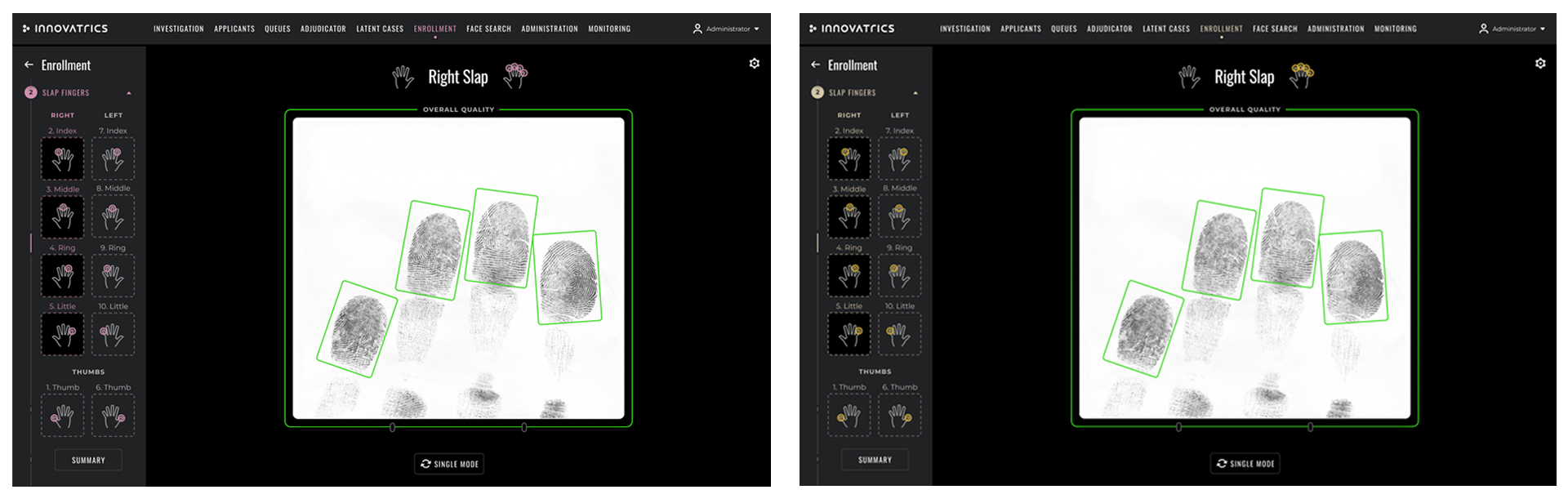
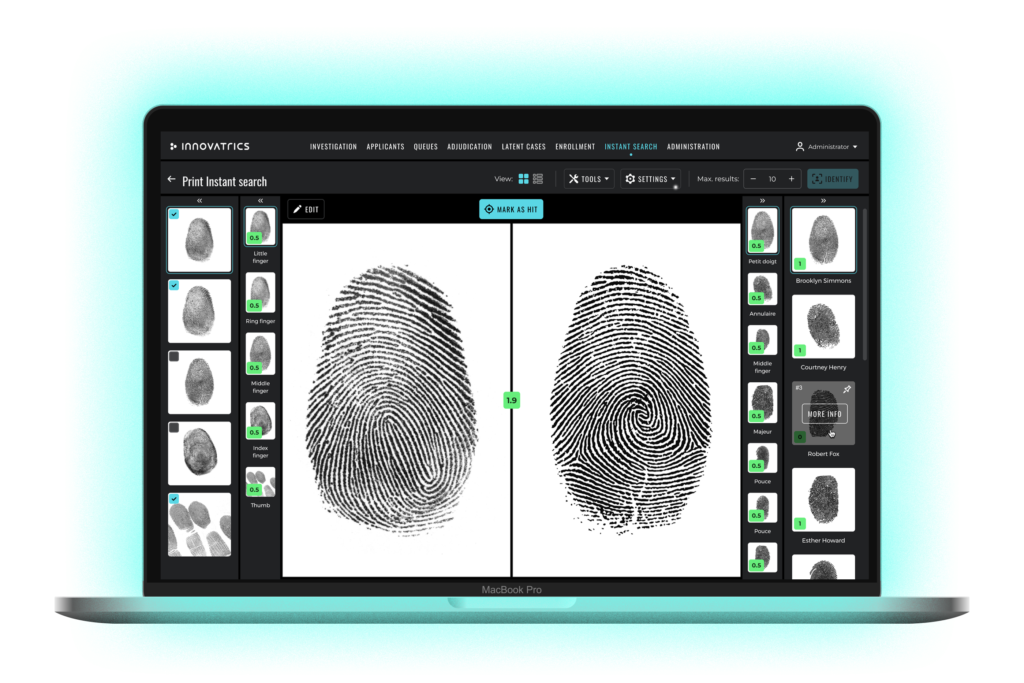
One of the most pressing problems was the amount of red the system used, for example, when comparing fingerprints of two various applicants to search for a match. Look at the screenshot below. Red was used for matching scores above each fingerprint as well as for the small illustrations that indicate the selected hand.
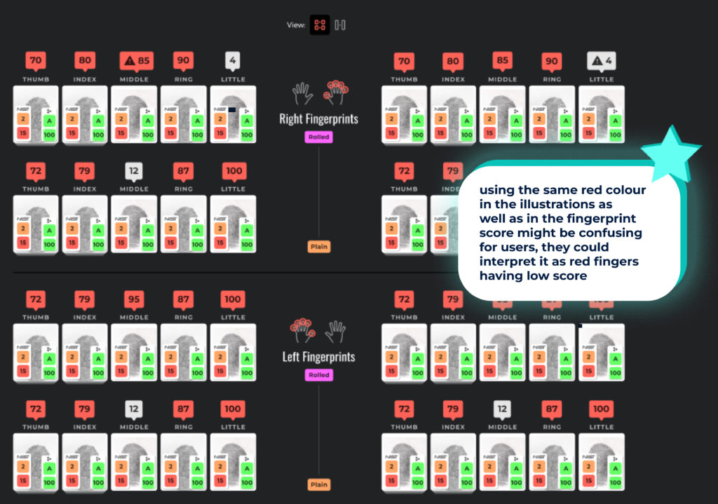
From the screenshot, one would assume that the red scores above each fingerprint indicate some sort of error or that they signal a low match between the fingerprints of two applicants. However, it’s the opposite. The red scores indicate a fingerprint match with the other applicant and the grey scores are the ones below the threshold for a likely fingerprint match. In addition, using the same red colour in the illustrations and the fingerprint scores might be confusing for users, who could interpret the red within the illustrations as meaning an error or low score.
Based on the intel from the workshop, the team proceeded to the next two steps:
- Picking a new colour palette for all interactive elements.
- Changing the colours of all remaining elements – tags, labels, ratings.
Choosing the right colour palette
One of the best ways to understand and categorise colours is to follow the principles of colour psychology, which explores how different colours can impact human emotions, perceptions and behaviours.
Just like yellow evokes joy or black sadness, all colours have associated meanings, and when used in harmony these colour meanings can impact the behaviours of users and create either superb or mediocre experiences.
To choose the right colour palette for the primary colour, we followed these five colour psychology principles:

Choosing the right colour palette for the primary colour was done in multiple rounds and initially involved a lot of trial and error. “At first, we went in all possible directions. We tried dark blue, yellow, peppermint green and even pink. All these colours, however, were either very low in contrast on the black background or didn’t match the unique Innovatrics brand colour palette,” explains Martina.
Meetings with the marketing team, where they thoroughly dissected the brand colour palette, proved to be the most important step. The team had to make sure that the selected colour palette for Innovatrics ABIS aligned with the overall brand colours and that the dominant colour in the design mirrored the brand identity.

Colour in UX design is not one-size-fits-all. “When picking the right colour palette, it was crucial for us to consider the industry and the target audience. We wanted to make sure that we’re speaking the same colour language as the people working with our solution,” explains Alica.
From research, the colour blue is inarguably the dominant colour for both tech and artificial intelligence industries. The colour blue evokes trust, reliability and security, which are also the values that Innovatrics emphasises. The colour is also in alignment with the brand identity of Innovatrics, which, as a true tech company, uses a dominantly blue colour palette.
However, just as with any other colour, blue comes in various shades, and selecting the right one is crucial.

Colour contrast brings individuality to each element of the user interface and makes them noticeable. Using a contrasting colour for call-to-action buttons makes these interactive app elements stand out and encourages users to take action.
Many of the initially chosen colour palettes had very low contrast compared to the black interface background. This could become problematic for users. “The first colour palettes we tried often looked completely different on computer monitors compared to large TV screens. We also had to address the fact that most users don’t own MacBooks but other devices that might not reflect the true colours of each palette,” explains Martina, regarding the difficulties with finding suitable colour contrast.
Inconsistent contrast across various devices could result in even lower contrast of the primary interactive elements. Understanding this, the team decided to work with shades that show good contrast on any device.

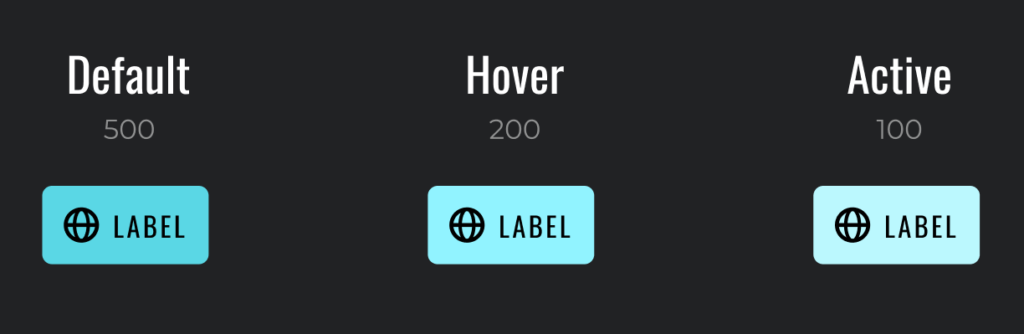
Microinteractions are the types of interactions that are hardly noticeable until they occur. They include interactions such as default, hover and active states and should always be a part of the final primary colour palette.
Adjusting the saturation and transparency of the primary colour on interactive buttons can make the app’s interface more intuitive and easy to use. For this reason, the team created different shades for each microinteraction necessary for the app’s interactive elements.

Colour consistency allows users to quickly identify patterns and elements within the interface. It also reduces cognitive load, aiding users in understanding the functionality associated with a specific colour palette.
Simply put, being consistent means that the colour you choose for an interactive element should only be used for that one element.
The lack of colour consistency with regards to the primary colour was one of the main issues with the app design. “Because we used the colour red for two different elements – both interactions and errors, the use of the colour wasn’t consistent across the interface. In addition, the primary colour also wasn’t consistent with how users perceive red in general. Instead of being triggered by the colour to act, the users mistakenly saw it as an error with no explanation on how to proceed,” says Alica.
“Based on these findings, choosing blue as the new primary colour was not only consistent with the brand identity and the tech industry, it also aligned with other important elements inside the app. The colours of semantic elements such as error, warning and success that pop up often within the interface and need to be noticeable, won’t collide with the primary colour used for interactive elements, such as buttons or navigation.”
– Alica Hollá, Product designer, ABIS, Innovatrics
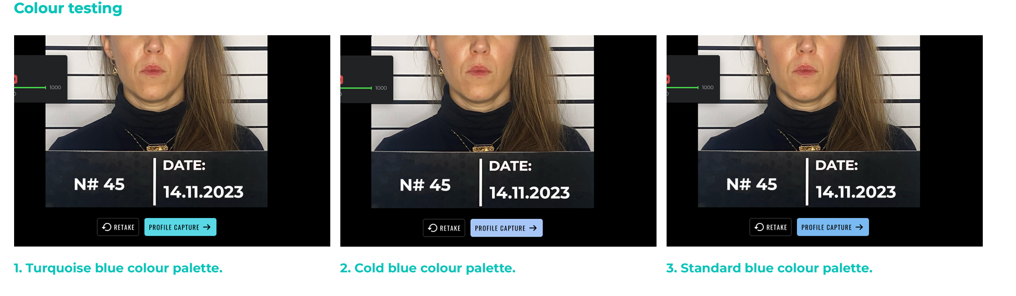
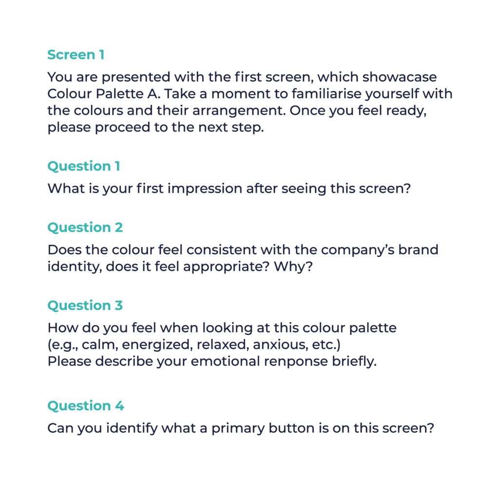
Testing the three selected colour palettes
Three final blue colour palettes made it into the last testing phase – standard blue, cold blue and turquoise blue. To test each colour palette, the design team primarily chose people who don’t work with Innovatrics ABIS. In this way, their interactions with the new colours could be truly authentic.
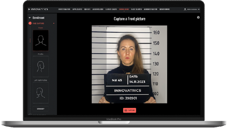
“To create the test assignment, we used the most crucial screens from Innovatrics ABIS. For example, we used the biometric face enrolment to create a prototype for each of the blue colour palettes, as this flow is usually easy to understand for the users,“ says Alica, explaining the design process behind the testing.
Each test participant had about 15 minutes to complete multiple tasks and questions. Overall, the assignment had two main objectives:
- See whether the participants can easily complete the tasks within the app interface.
- Learn each participant’s impressions about each specific shade of blue.
Participants’ reactions to the colours were surprisingly diverse. Some argued that the cold blue palette looks better because it is more conservative. On the contrary, most participants found the turquoise blue palette more energising, warm and distinctive.
The last task consisted of lining all three colours next to each other and asking for personal preference and overall suitability for the system. “Our goal was to find out whether the colour communicates the main purpose of ABIS well. The majority of participants voted for the turquoise blue colour palette, mostly because the colour felt distinctive, noticeable and energising,“ says Martina, summing up the test results.
The final winner
Based on both the testing exercise and in alignment with the principles of colour psychology, the design team chose the turquoise blue as the new primary colour of Innovatrics ABIS. The colour is consistent with Innovatrics’ brand guidelines and with how the brand aims to communicate to their audience. It evokes stability, trust and security, which are some of the most important characteristics people look for in a tech company.
“We applied the new primary colour to all basic interactions, including buttons prompting user actions, navigation indicating the user’s current progress, and all other interactive elements.”
– Alica Hollá, Product designer, ABIS, Innovatrics
Defining a whole new colour system
The ABIS design team didn’t just swap one primary colour with a new one. They defined a whole new colour system based on the various elements within the app interface and their distinct meanings.
The team created a plan on how to approach the current design system and its colour palette, and conducted an analysis of the previous palette. They found that the previous palette didn’t define or incorporate informational and semantic elements like error, warning and success. Even though these elements were well-functioning within the app, their colour palettes were not properly defined. They decided to expand the previous palette and include all elements present in the Innovatrics ABIS.
“To create a new colour palette that works well with our system, we followed the same colour psychology principles used for choosing the primary colour. Our aim was to create a colour dictionary to work with regularly and whenever we needed to ensure maximal colour consistency.”
– Martina Budziňáková, Product designer, ABIS, Innovatrics
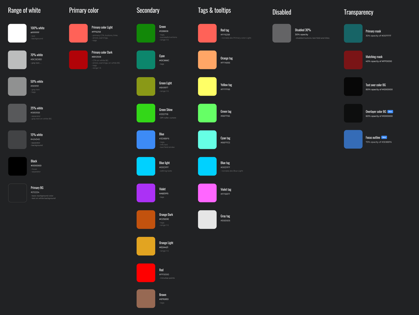
The new colour dictionary included descriptions for bounding boxes and specified colour palettes for interactive, semantic and informative elements as well as exact background colours. In addition, and in line with the principles of colour psychology, the team specified different colour shades for microinteractive states, such as default, hover and active.
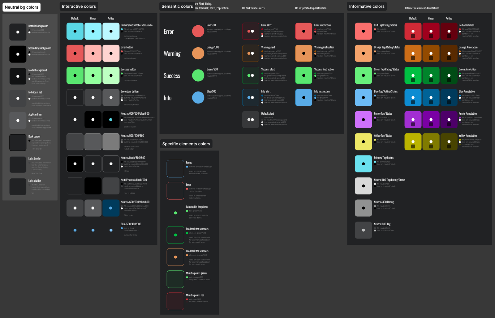
Another important element the team redesigned were the colours used for informative elements, such as various applicant statuses. These informative colours don’t represent specific feedback or actions. They simply provide information about the current stage of a process.
The users can also choose between these colours when making notes and annotations within the application. For example, forensic experts can mark items with markers, choosing colours as if they were working in a sketchbook.

In this way, the Innovatrics design team was able to create a consistent and detailed visual communication and make the system understandable and more intuitive to use. “Creating the new colour dictionary for the Innovatrics ABIS proved again the importance of good UX/UI, even for a company specialising in biometric solutions. Our solutions can be the best in the world, but without a clear and consistent visual language their true value might be left unutilised,” concludes Martina.
AUTHOR: Kristína Zrnčíková
COVER ANIMATION: Adriana Mišková

