Head of UX Association Michal Blažej: “Banks often make the app more complicated to use, just to be different from a competitor.”

Contributors

Head of the Slovak UX Association

Banking apps are not supposed to be distinctive and fun, but secure and customer-centric. The market forces banks to differentiate themselves but not many do rigorous customer research that would help them better understand what their customers truly want.
Biometric features such as face recognition or fingerprint scanning have helped banks to grapple tough privacy and security regulations and speed up the now fully digital onboarding process. But there is more to banking apps than first meets the eye – the processes around biometric technologies have to be designed in a trusted and intuitive way. We talked to Michal Blažej, head of the Slovak UX Association (SUXA), about how to recognise good banking UX, and what the true conversion killers in client onboarding are.
Looking at the journey that banking apps have taken since their inception, what major changes do you see from the UX point of view?
Initially, banking apps were very isolated IT projects where the banks tried to copy traditional internet-banking services to accommodate the smartphone screens. They were essentially either mobile websites with very limited browser functionalities, or very slow smartphone apps. Users would be served with complicated interfaces and hard-to-understand banking jargon.
As the smartphone market grew substantially, banks quickly realised the potential and became more customer-centric, delivering simplified interfaces coupled with user-friendly language. But there were problems: due to complicated security and legislation, the banking apps provided a worse customer experience than other mobile services.
Updated policies and advancements in tech, such as Optical Character Recognition (OCR) or face recognition, allowed for substantial security simplification, and the number of users accessing their banking accounts via smartphones grew significantly.
What is Optical Character
Recognition (OCR)?
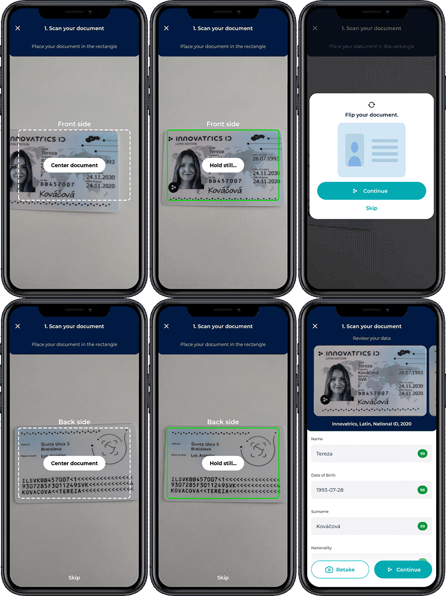
OCR is a technology that automatically distinguishes both printed and handwritten text inside a scanned document or image file, and converts it into a machine-readable form for further processing.
The pandemic has helped digitalisation in banking a lot. The speed of payments through QR codes increased and digital user onboarding has become a necessity. We’ve taken a big step forward. Today, the apps offer a pretty decent customer experience, even though there is still room for improvement in what UX experts call progressive disclosure – sequencing information to make the interface cleaner and easier to navigate instead of having everything available in three clicks.
From your UX perspective, what are the elements of the current banking apps that are common, but useless?
The market forces banks to differentiate themselves and having a better app is one of the ways to go, so they innovate a lot without thinking it through. But not many go the extra mile and do rigorous customer research that would help them better understand what their customers truly want. One example is making the app fun to use – but banking is a serious thing, it’s your money. You want to feel secure, you don’t need to see emojis everywhere.
Banks also often introduce functionalities that make the app more complicated to use and are expensive to run, just to be slightly different from a competitor. But I have seen the usage statistics and a majority of these functionalities have very low usage. We are talking about functionalities such as peer-to-peer money exchange, cashback or rewards.
Take roundups – banks say that they will round up your payments by a couple of cents, but after looking at your savings account at the end of the year, you come to find out there is just a couple of euros that you have saved and you feel disappointed.
Another example is PFM – personal finance management. The majority of banks are trying to implement some sort of spending dashboard to improve clients’ financial literacy. They look good, but fail to give any call to action or systematic change of behaviour.
So, I would advise banks to do more thorough research on what customers really want, and target the apps to the specific needs of each customer persona. This would render higher customer satisfaction than offering gimmicks that need to be heavily promoted before most customers will actually use them.
“Not many banks do rigorous customer research that would help them better understand what their customers want. One example is making the app fun to use – but banking is a serious thing, it’s your money. You want to feel secure, you don’t need to see emojis everywhere.“
How does regulation in the financial sector influence UX design?
It’s much better than it used to be. Now a client can open a bank account and get a loan digitally if everything works. I purposely say “if everything works”, because the client needs to orchestrate a number of services provided by e-government that might not work.
Still – there’s no way to get a mortgage online. The process is just too complicated and has too many stakeholders, though it can be launched online.
Do you see the influences of popular apps (e.g. Facebook, Instagram) on banking apps? Do banks try to use the familiarity of such apps to make users feel comfortable?
Sure, banks know well that they need to de-stigmatise banking and make it more approachable. You can watch introductory guides inspired by Instagram stories, add functionalities to the app – such as the Revolut Hub via “app store”, and use communities to build a contact book of people you often send money to. But they are not a copy of Facebook or Instagram designs so much as leveraging interaction patterns present in modern mobile interfaces.
During the digital onboarding of new clients – what usually causes clients to abandon the process? Is it related to the time spent opening a bank account, or the number of required clicks?
It’s not about the number of clicks so much as how many UX fails the users experience. The worst cases include forcing clients to re-enter data, asking the same question twice, having a client wait a long time while checking data against external registers, or the inability to fully complete the onboarding digitally. The process has to cater to different contexts, meaning that banks should provide alternatives to video calls when the client asks for them.
And yes, it is all about speed – users want to complete onboarding as quickly as possible. But sometimes banks build an extra problem into onboarding, such as when the app makes users customise their account before fully submitting, trying to upsell an extra product or asking questions that users do not see the reason for.
What biometric features are the real game-changers from the UX perspective?
Any that work. OCR is a technology that can read clients’ documents from a picture or camera snap. It speeds up the data input and allows users to skip steps. Facial recognition or fingerprint scanning lets users omit the process of inputting a passcode to authorise a payment or authenticate themselves. Some technologies are able to evaluate whether the person on the camera is live or if their ID is real. This saves users from falling into risk-checking procedures that are usually conversion killers or create extra work on the bank side.
Liveness detection
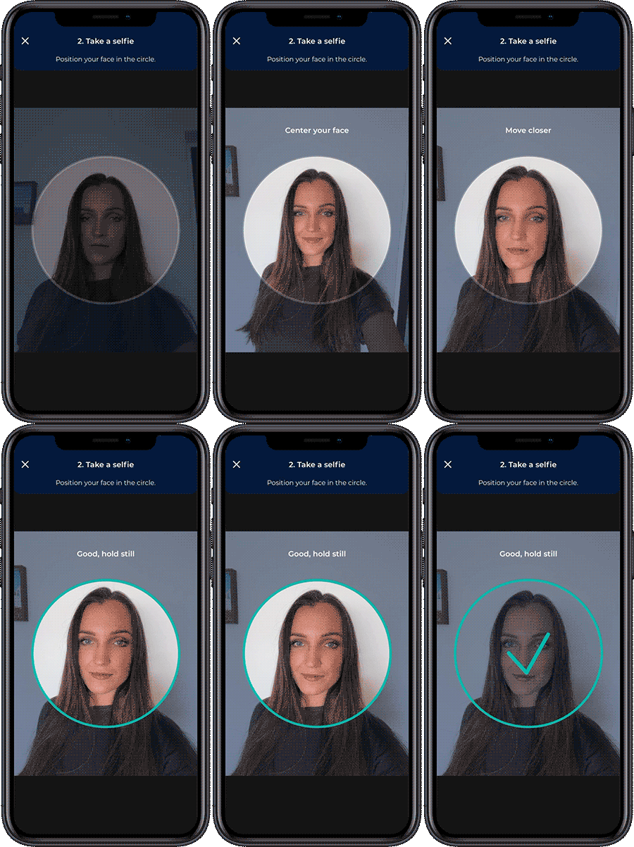
Biometric liveness detection is a test that verifies whether the person requesting your service is the same person that is physically present during the process of authentication, and that they aren’t using a method in which to spoof the system, such as a picture or a 3D mask.
What are the visible and invisible tech features that make the whole identification process smooth?
It’s not about technology anymore. There are plenty of technologies available that work well. A quality user experience is rather about deep knowledge of your clients’ needs, wishes and motivations. Banks must understand the mindsets of their target groups and act on their needs by providing features and functionalities that make them feel that this bank is a good fit. Clients must feel sure about where they are, what the next steps are and what is expected from them. It is about the right emotion, messaging, visual presentation and contextual interactions; plain technology is not enough.
“A quality user experience is about deep knowledge of your clients’ needs, wishes and motivations. Clients must feel sure about where they are, what the next steps are and what is expected from them.”
Is there any data on how people perceive biometric technologies in identity verification?
There are two groups of people: those who trust it and those who don’t. The first group is getting bigger and we should thank Apple for introducing fingerprint scanning and facial recognition to the masses. The second group is getting smaller and you cannot do anything about those customers in the majority of cases. You may educate them, but there will be a small impact. You need to give them old-school options.
From our qualitative studies, people trust biometric technology and find it helpful. Even in cases when it is not about speeding up the process for them, like liveness detection. But they need technology that does not fail them.
What does PSD2 regulate?
The Payment Services Directive 2 — known under PSD2 — is a European regulation for electronic payment services,seeking to protect consumers by making payments more secure in Europe while enabling new payment services and boosting innovation in banking. ]
What should an ideal UX design look like from your point of view? What changes and innovations do you hope for in the future?
I just hope banks will stop adding gimmicks they think everybody has to love. However, we could see more customisation for given use cases that cater to the needs of specific target audiences. Overall, I’d like to see a more real customer experience and service design that will not merely alter app design, but also improve service provision.
Clients will be able to better customise their banking experience; I am not talking just about apps, but about the banking service that is delivered over apps. We need a more liberal approach to banking – to be more in control. Through the Payment Services Directive 2 (PSD2) regulation, clients will be able to connect their financial services to other apps and unbundle their packages into useful features that could be turned on or off, such as access to markets or wealth management.
Banks will become increasingly more digitalised and banking apps, being a vital part of the progress, will mirror the digital disruptions within their operations. Hopefully, digital mortgages will be next.
Michal Blažej
At SUXA, Michal Blažej and his team actively support the growth of good UX by organising professional events such as the UX Bootcamp, putting proven standards for UX into practice, facilitating professional development and training, and supporting academic and business collaboration. Beyond his work at SUXA, Michal also co-founded the Lighting Beetle agency, which is dedicated to designing superb UX for complex websites, smartphone apps and software. In his everyday work, Michal promotes designs based on customer research, testing and measurable data. During the 10 years of the agency’s existence, he has participated in more than 200 user-centred projects in 15 countries around the world, for the IT segment, banking, insurance, cleantech, telco, and more.
Senior UX designer Tomáš Janek: “Our ability to speed up technological progress is our biggest advantage in UX design.”

Without fast-evolving and adaptive biometric technology, digital onboarding through banking apps would not be possible. For Tomáš Janek, a senior UX designer at Innovatrics, biometric technology simplifies processes like digital onboarding by adapting quickly to the needs of the users via constant improvements of the technology. In this way, it is about making the process fast and convenient for the user as much as it is about creating better conditions for the technology to learn and become more efficient.
The most important aspects of good UX in biometrics.
For Innovatrics, two aspects of good UX usually stand out – speed and trust. Users want to finish the process as quickly and conveniently as possible, but while also trusting that their data will not be misused – and this is where the innovations in biometric technologies claim the biggest advantage.
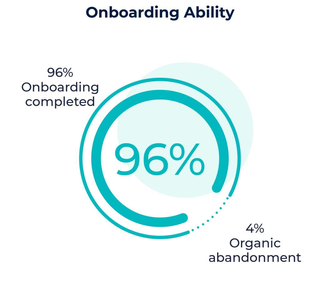
Even though the adaptation speed of biometric technology is the real UX game-changer, Tomáš quickly adds that “the behavioural aspect of UX design is important too. Without the combination of technology and design, our current success rate of 96% of clients onboarded on the first try, or getting a loan within just one minute, would not be possible.”
“At Innovatrics, I’m part of a team of three UX designers who oversee the whole process – from defining UX problems or areas for improvements to designing, testing and implementing user flow prototypes. Our goal is to have the clients trust the process and finish it without confusion.”
Face Auto Capture technology is one example of such a process. The system automatically assesses conditions such as the optimal lighting or ideal face orientation and, when all requirements are met, it autonomously takes a selfie of the onboarding client. Such improvement ensures the best quality photo possible, avoiding user errors such as blurred selfies or a finger covering the lens.
How are the ICAO standards used in biometrics?
Reading the ICAO (The International Civil Aviation Organisation) parameters of the user’s face and instructing them on how to set up the camera and environment in realtime both speeds up the process of face recognition and improves the accuracy of the algorithm. For example, the system can instruct users to look into the camera, turn their heads, remove their glasses, or move towards the light.
Liveness detection is one of the trickiest biometric technologies for creating a cutting-edge UX design. Users want the app to validate as quickly as possible that they are indeed real, but equally can become skeptical if the technology is able to check their liveness without any input from their side. “At first, we had the client follow a ball on the screen to prove their liveness with eye movement. But as we kept updating the technology, we realised that we don’t need any action from the client to check their liveness, so we dropped it.“
This decision left the onboarding clients confused and suspicious. “How does the bank know I’m real even though I didn’t prove it with any action?” The user experience with biometric technologies is almost exclusively built on trust, but users had a problem believing their action was not needed; they wanted to be sure that the system handled their data properly.
“After the feedback, we came up with smile liveness – a liveness check asking users to smile to prove they are real. A smile has movement and depth and cannot be faked with a photo.” But when testing the prototype, they came across some unexpected findings: “A lot of users smiled on the screen before they were asked to smile by the app, which led the app to evaluate their expression as neutral, confusing the users. We theorised that some users just can’t help but smile when put in front of a camera,” concludes Tomáš, smiling.
Tomáš Janek
Tomáš is a senior digital product designer at Innovatrics. He has 11 years of experience and his work focuses on UX design. Tomas initially worked on perfecting the user experience of most of Innovatrics’ products by designing, prototyping and testing defined user flows. Later, he became an integral part of the ABIS (a large-scale fingerprint matching, iris and face recognition system) user-experience team, where he currently designs the processes around fast and trustworthy identity verification used by police departments.
AUTHOR: KRISTÍNA ZRNČÍKOVÁ
ILLUSTRATION: MATEJ MIHÁLYI


